
Redesigning the pelvic exam experience.
*That’s three drinks, if you’re playing at home.

Gender disparity is real, and traditionally, medical equipment designers have tended to have penises. That is problematic on a general level, but specifically, it means that problems that are specific to vaginas are often ignored or overlooked.
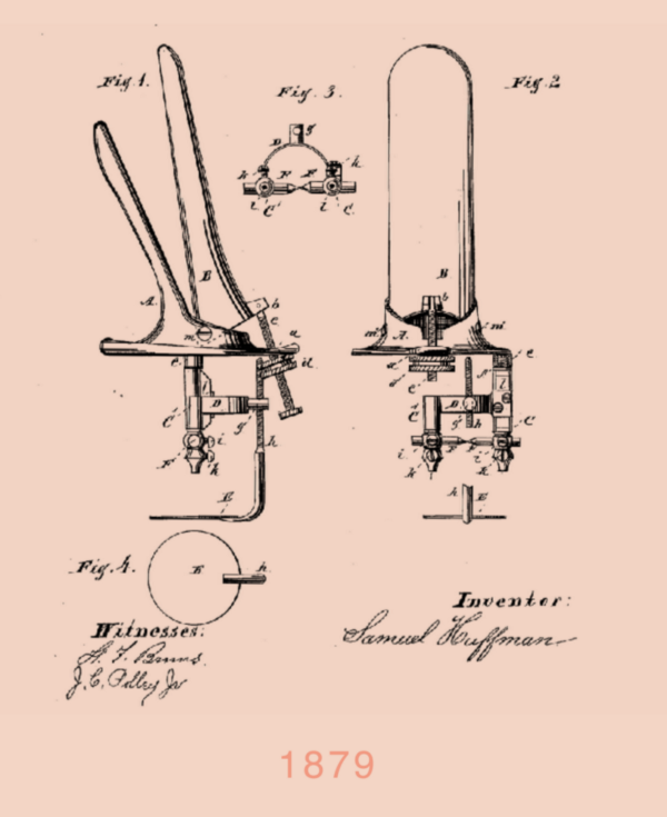
Last night, we put on an event at Bolt entitled Designing Women’s Well-being. We invited the Yona team from Frog Design to talk about how you go about solving a vagina-specific challenge: the pelvic exam. Today, the exam is conducted using a speculum, a device that hasn’t changed much since its invention 138 years ago. The Yona team looked at the speculum and concluded that there is no reason why the responsibility of taking care of a vagina should cause such routine discomfort that many people delay or even forego the exam altogether.
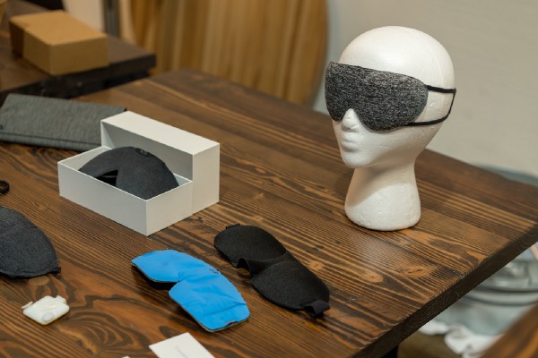
At the event, we did three things: We invited the Yona team to tell us more about the process of designing their product. We invited a number of other exciting hardware startups to show off what they are working on. And we played a drinking game: Have a sip of your drink whenever the word ‘vagina’ is used. You can play along at home, too. The post’s title should get you started. You’re welcome.


Yona: Talking to Users
The Yona designers work at Frog Design and follow the design consultancy’s user-centered design approach. The pelvic exam has two key stake holders, patients and providers, and a successful redesign has to serve them both. The team spoke with patients from across the spectrum of experience with pelvic exams and providers from Planned Parenthood, UCSF, SF General and NYU.
“We started Yona as an early-stage experience-design concept that looks to reimagine the pelvic exam from a patient centered approach,” explains Hailey Stewart, one of the driving forces behind the product. “To do that, we are both looking at redesigning the speculum itself, and at the overall exam as an experience.”
“Our conclusion was that the whole experience needed to be redesigned.”
While the design hypothesis was that speculum insertion would be the crux of a patient’s discomfort, user research revealed that the moments prior to the exam when you’re sitting naked in a paper gown on that crinkly paper not knowing when your doctor is going to come in was actually equally anxiety-inducing for the patient. Hailey shared, “Our conclusion was that the whole experience needed to be redesigned.”
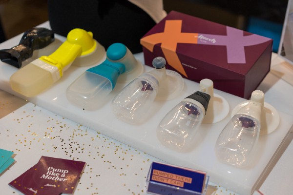
If you go for a pelvic exam today, your doctor is using a speculum that essentially hasn’t changed since 1879. If you think the original design has such staying power because it exceeds users wildest expectations, you’re wrong. When talking to providers, the Yona team heard dispassionate answers like, “It’s okay,” or“it gets the job done.”
As Fran Wang, Yona’s mechanical engineer put it, “those are just C+ answers.”
Yona’s redesign will have to achieve the core purpose of the speculum- to give the provider a clear view so they can make an accurate diagnosis- but it also seeks to improve exam efficiency for providers, minimize patient pain and discomfort, and elevate patient dignity.
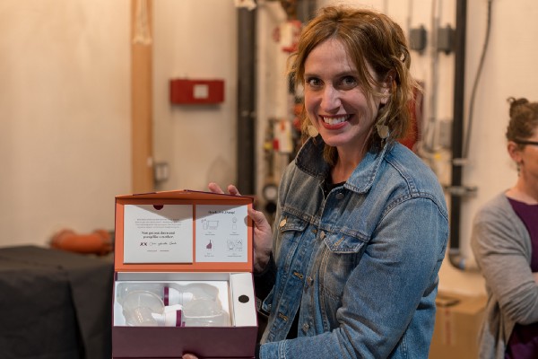
The Yona experience includes a number of non-device features. The digital experience considers everything from filling out forms to a guided pre-exam meditation to calm your mind and relax your body. Yona also created an optional “comfort box” including simple things like socks to cover your feet in the stirrups and a stress ball. The box itself doubles as a place to put your personal items when you change, a simple way to avoid the awkward tower of intimates toppling off the exam rooms extra chair. All of these details are key to the Yona experience, but here I’ll dive more deeply into the speculum redesign itself.

Redesigning the Device
Today’s speculum is a bivalved design, which means there are two parts that move relative to each other and can crank open or closed. I use the word crank here intentionally, as it truly does communicate both the auditory and tactile experience of opening a speculum. The bivalve design also requires the provider to crank the device open quite far in order to separate the vaginal tissue enough to have visibility.
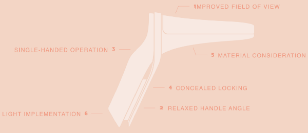
User research revealed that the angle of the current speculum handle causes a provider’s hand to run into the edge of the exam table when inserting the speculum into the vagina. This is the reason patients have to make the dreaded “last scootch” to the edge of the exam table, a phrase which had the entire audience nodding in horrified recognition last night.
Speculums today have external screws which cause a myriad of clunky user experience issues for both providers and patients. First off, this design requires providers to use two hands: one to insert and open, and the second to tighten the screw. Additionally, most speculums today are metal, which makes them easy to sterilize but also causes them to feel cold and look totally creepy.
Sound and Discomfort
Yona’s speculum has a three-leaf design, allowing the top two leaves to move upwards and outwards together, creating an improved field of view without having to open the device so far, minimizing physical discomfort. Yona also added a light source to improve the provider’s field of view, because duh, it’s pretty dark in there.
Dignity- Adjusting the angle on the speculum handle enables the patient to sit higher up on the exam table, increasing patient dignity.
Usability- The Yona speculum can be used with one hand, and is hand agnostic, making it usable by both right handed and left handed providers. Provider interviews also surfaced harrowing tales of screws occasionally pinching tissue, an all together awful combination of words. Moving the screws to the inside of the speculum eliminates the possibility for this totally unacceptable occurrence.
Creepiness & Temperature– The speculum is a medical device, so the ability to clean and sterilize is paramount. Yona is taking cues from the sex toy industry and exploring body safe silicones that look more approachable and don’t have the terrible temperature shock metal speculums are known for.


YONI + VAGINA = YONA

Yona’s commitment to inclusivity is genuine, and it shows up in their brand. On the naming process, Rachel Hobart, Yona’s visual designer, shared that they immediately wrote off anything woman-centric or female-centric for a simple reason: not all people with vaginas identify as female.
The team turned to the Sanskrit word representing female life form and divine procreation, Yoni. They cross pollinated yoni with vagina, and landed on Yona. As Rachel put it, “It’s a pretty dope word.”
Yona’s brand character, Jamie, also carries an intentionally androgynous name, and their features are designed to be accessible to anyone who relates to the pelvic exam experience, regardless of age, gender, race, or sexual orientation.

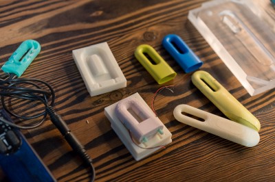
Right now, Yona is a concept, an exploration, a conversation. I think it’s one worth having. While there’s much left to figure out in order to replace the average pelvic exam with the Yona experience, this team is clearly asking the right questions and committed to delivering a product experience people with vaginas deserve.

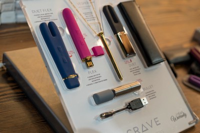
This vagina-extravaganza was a collaboration between Women in Hardware and the Industrial Design Society of America. Many thanks to Nichole Rouillac of Level and and Ti Chang of Crave for co-hosting- you two are are truly rad humans. Many thanks to Bolt for buying the wine, we drank a lot of it.
If you have suggestions for topics, speakers, or product verticals we should organize events around in the future, reach me on Twitter @katepmcandrew


Bolt invests at the intersection of the digital and physical world.
