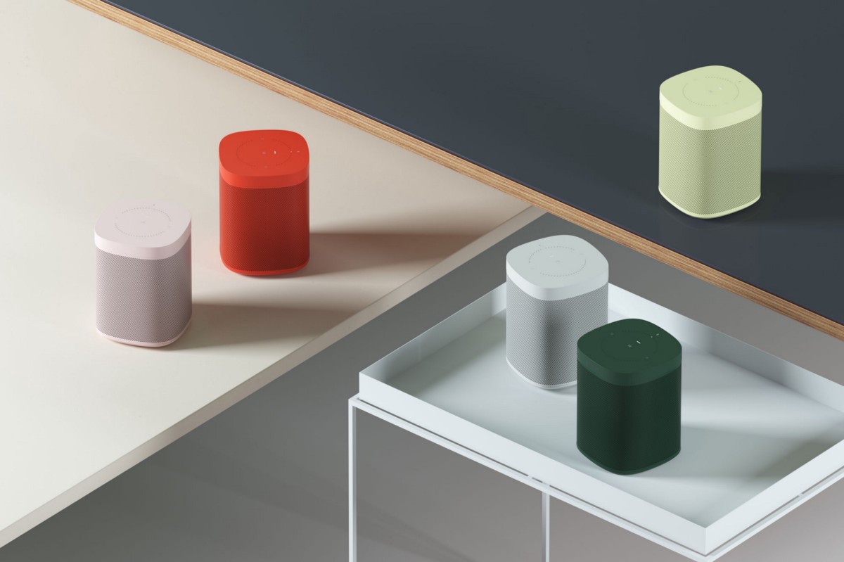
Sonos is biting off a challenge by launching new color combinations with HAY. Is it worth it, and should you, as a startup founder, do the same?
Sonos recently started shipping a special edition of their Sonos One speaker that was the vibechild of a collaboration with Danish design house (and one of my personal design crushes) HAY. Functionally, the product is the same as the original Sonos One — recast in a vibrant color palette designed to resonate with a wider range of interior design touches and architectural space.
At Bolt, I work with a lot of startups, helping them develop their products. Seeing something like the Sonos/Hay collaboration makes me think about the complexities involved, and in this post, I’m going to take a closer look at just that.
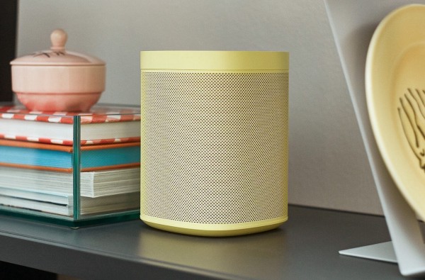
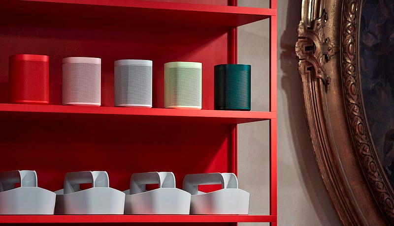
“In terms of colors, we were inspired by our daily home life. We wanted to create colors that were for everyone,” creative director Mette Hay explains. “The green hues were supposed to remind viewers of pots or plants sitting by windows. The light grey is for everyone, but it was important to find the right shade — a shade that suits both workspaces, homes, and different looks with its neutral tone. Pink is intended for the fashionable person. We feel that all things pink create a special desire right now.”
What does a broader color palette mean from a product development point of view?
As a product developer, I’m impressed with the ambition of this project. The amount of work and craftsmanship that goes into offering a product in new colors is often under-appreciated.
Even for a single-color configuration of a product, color matching different parts (metal and plastics for instance) can be quite challenging and dependent on the materials, tooling, process, and cosmetic inspection criteria.
Offering multiple color configurations for a product is not for the faint of heart or shallow of pocket.
There are a number of reasons why a wider color palette is challenging to do well. A few points come to mind:
- New colors will often require new safety and regulatory certification. Flammability ratings of plastic can be color dependent. Certain material characteristics can change things too — the carbon content in black paint, for example, can impact radio emissions.
- Different color plastics are molded with different material formulations that can exhibit different cosmetic defects and require modified process parameters (temp, flow rate, etc) to fix.
- Different color plastics can also require new, dedicated tooling and setups to prevent color contamination or needing to purge machines constantly (no color in the white molds!).
- Metal parts are often made at different sub-suppliers than plastics so getting color matched paint/powder coats/anodization can be a long and iterative process.
- Procurement, operations, and distribution channels must all deal with the inventory management and logistics overhead of multiple SKUs.
Offering multiple color configurations for a product is not for the faint of heart or shallow of pocket. You rarely want to try this 1) for a first generation product or 2) as a fledgling business. Even for massive companies with global engineering, operations, and quality teams, you typically see no more than 2 colors until later product generations (iPod mini, 3rd gen Nest Thermostat, iPhone 5C). The engineers and operations folks usually aren’t exactly clamoring to be on the color update projects.
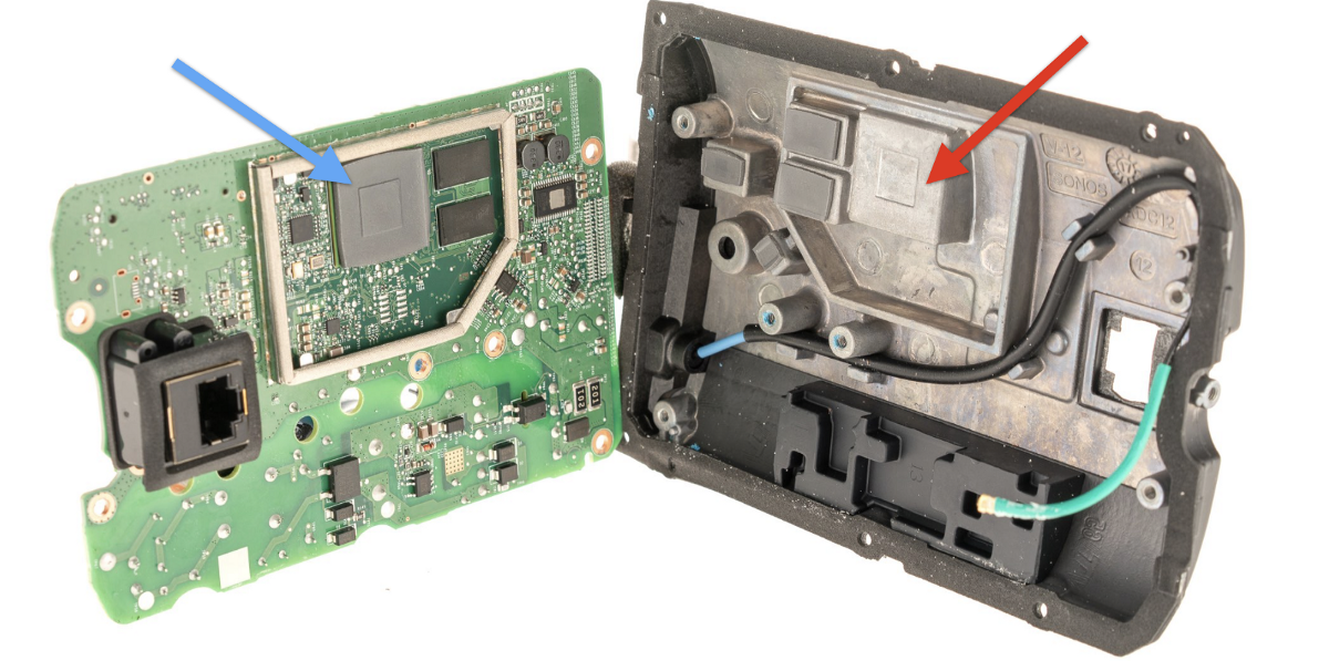
If you check out our previous teardown of the Sonos One, you can appreciate the number of various components that need to be updated for matching or complimentary neutral colors:

- Complex injection molded parts
- Powder coated metal mesh
- Cast + coated metal parts
- Speaker components
- Power cords
- Hardware — screws, etc
- Connectors — USB, ethernet, etc
- Screen printing
- Serial number/certification stickers
- Packaging + manuals
In addition to the color consistency of the product itself, these devices also need to match the furniture and home goods they were inspired by. Mind. blown. 🤯
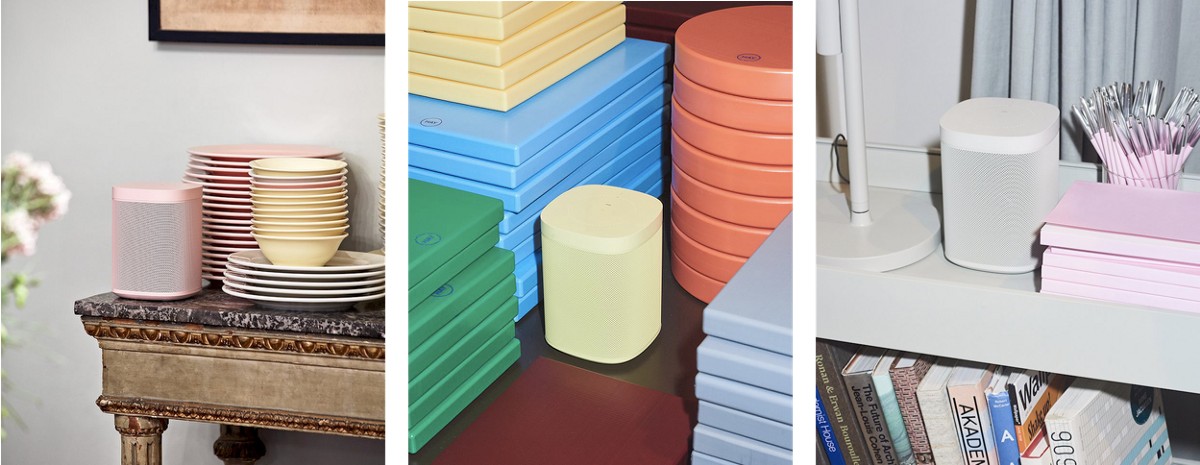
The question that remains is whether, as a customer, you are willing to spend the extra $30 for a different color Sonos One. The special edition colors are also not put into the usual channels, so if you want one, you have to order it from Sonos directly or find your nearest design specialty retailer.
Choose your battles
At Bolt, we work with our portfolio companies to ship great first-generation products to new markets. We encourage our companies to tackle hard problems when it adds special value to customers.
One example is our portfolio company Core, which makes a personal meditation trainer. The bottom half of the device is made of wood.

“We didn’t want a meditation guide to feel too techy or cold, even while being a smart device,” Sarah McDevitt, the CEO at Core explained to me, “The solid wood is so important to making Core feel grounding and comfortable in your hands, and to look great in your home or office.”
Wood can be notoriously difficult to manufacture precisely and source at scale — but given Sarah’s vision for the product, Core decided to invest the extra development cycles to deliver a beautiful product with the fit and finish they wanted.
Only Sonos knows for sure whether adding additional colors to the Sonos One lineup was worthwhile. I feel that the development effort is probably more valuable to the brand than to the bottom line. They certainly picked up a significant amount of press coverage in the process, and I think it says a lot about a brand’s craftsmanship and appreciation of a product character to take on an ambitious collaboration like this.
For Sonos, working with HAY may make sense because it makes the speakers look more fun and fit into a fresh set of locations. For Core, choosing to use wood is a natural fit because it improves the user experience. Both these choices have something in common: a great deal of clever work goes into making something seem effortless. Pick your battles wisely — and only when it truly adds something special to the product experience.
Bolt invests at the intersection of the digital and physical world.
