This is Part 2 of a 4 part series on the hardware product development process. If you missed Part 1 (Ideation), be sure to check it out. Head over to Part 3 (Engineering) and Part 4 (Validation) if that’s more relevant to you.
Part 2: Design
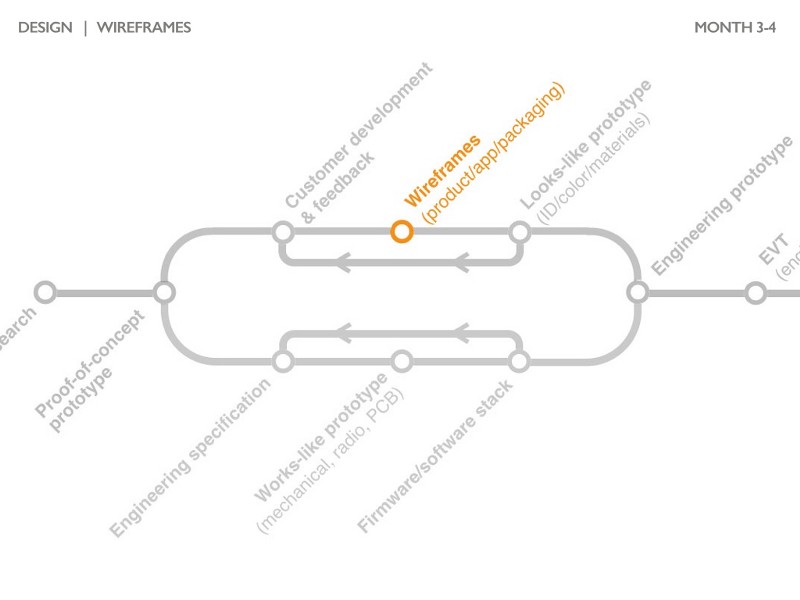
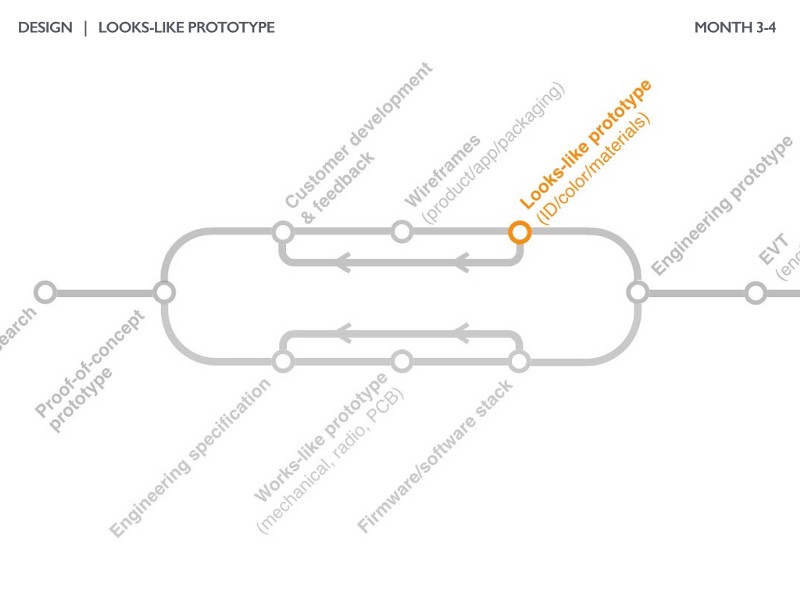
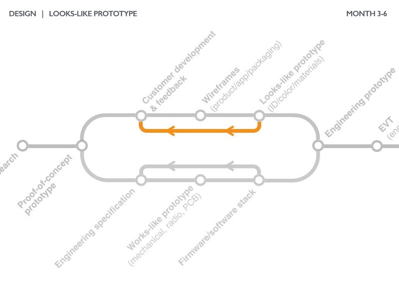
Each step in the design phase (customer development, wireframes, and looks-like prototypes) is designed to test assumptions of what a product will look like and how a customer will interact with it.
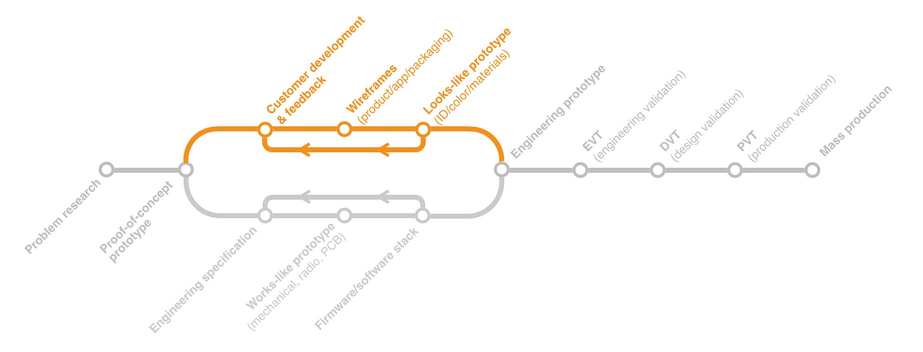
Customer Development + Feedback
Startups that focus on customer feedback are far more likely to succeed than those that sit in a basement and engineer endlessly. For some reason, this “basement engineering” happens far more often with hardware companies than their software counterparts. While interviewing and communicating with customers is always a good idea, it’s most critical during the early design phase.
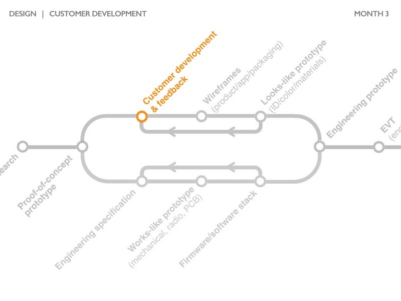
DipJar has always been laser-focused on validating their assumptions with customers. After building a proof-of-concept prototype, the jars were put into the wild.
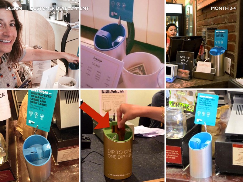
A design mentor of mine once said “you can only learn how much your design sucks when you watch people use it.” One problem the DipJar team saw constantly (marked with the red arrow): users would put the credit card in backwards causing a failed swipe. It became clear that this was a primary design constraint.
Conversations during this phase of customer development (vs conversations during problem research):
- Have a detailed script and stick to it as much as possible
- Take detailed notes and/or recordings
- Track NPS if possible (many companies prefer to do this later in the development process and that’s okay)
- B2C: Allow users to play with the product (when you’re ready) without explaining or setting them up for it.
- Don’t ask what customers would change; observe how they use it
- Don’t focus too much on details; things like color and size are outsized biases
Wireframes
After a solid foundation of feedback from your proof-of-concept prototype, it’s time to iterate the design of the product.
The wireframing process begins with high-level “sketches” of the full product experience. We call these storyboards.
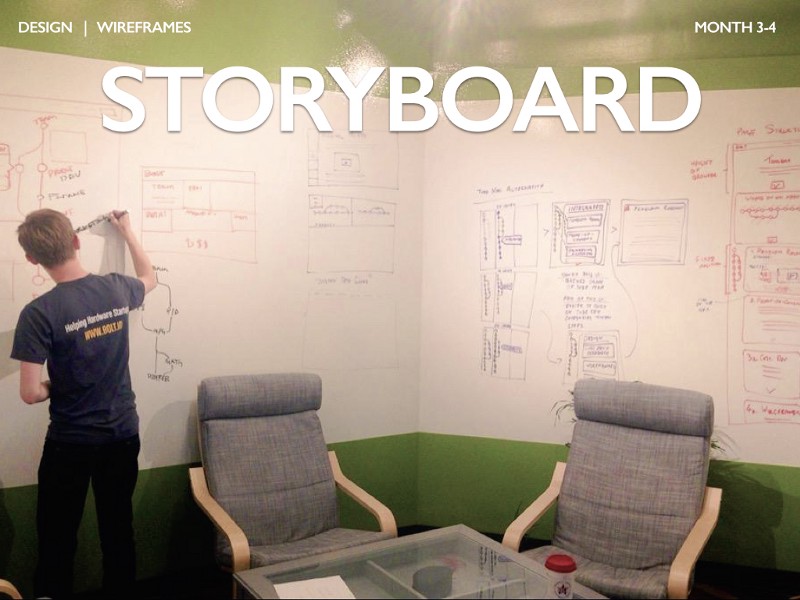
Storyboarding is designed to force founders to think through the entire product journey. Storyboards often depict:
- Packaging — what does your packaging look like? How do you communicate what your product is in 9 words or less (average box area)? How big is your box? Where does it go in a store/shelf?
- Sales — where is your product sold and how to people interact with it prior to purchase? Are there interactive displays? Do customers learn a lot about your product prior to buying it or is it more of an impulse buy?
- Unboxing — what is the experience of opening the box? It should be simple, obvious, and require minimal effort.
- Setup — what steps does a customer go through to get your product ready for first use? What is required besides accessories you’ve included in the box? What happens if it doesn’t work (i.e. can’t create a wifi connection or smartphone app doesn’t install)?
- First use — what does the product do to ensure users get comfortable quickly with your product? What have you designed into the product to delight your customers?
- Repeated use or special use cases — how do you ensure users continually come back to your product and enjoy their experience? Are there special use cases your product may get into: loss of connection/service, firmware updates, a missing accessory, etc?
- Customer support — when users have a problem, what do they do? If they’re sent a replacement device, how does that transaction/setup occur?
- End-of-life — most products are retired after 18 or 24 months. How does this fit into your buyer’s journey? Do you expect users to purchase another one? How do they transition from one product to the next?
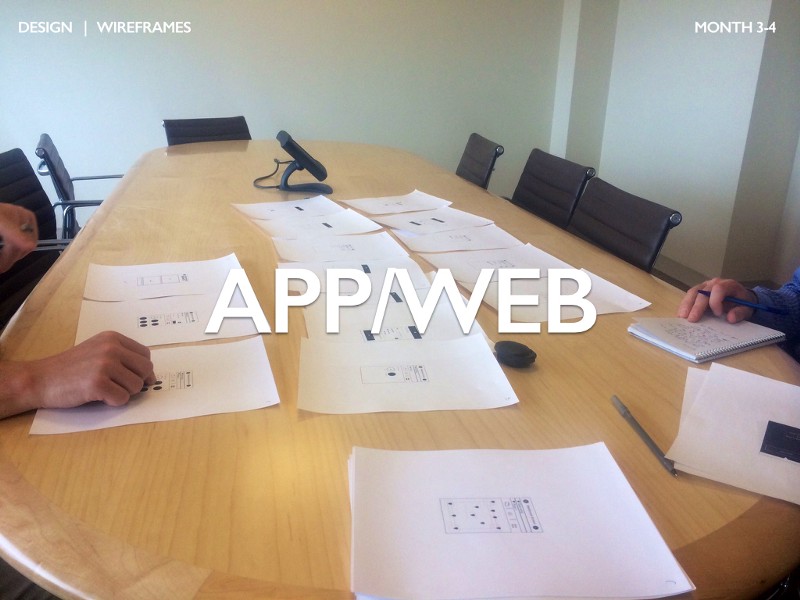
More traditional wireframes are also useful if your product has a digital interface (embedded, smartphone app, and/or web). These are typically simple black and white line drawings although some digital tools can be useful. In the picture above, you can see a founder on the right taking notes while interviewing a potential customer on the left with his finger on an app screen. Although testing digital workflow like this is extremely rudimentary, it is surprisingly effective.
By the end of the wireframe process, you should be left with a good conceptual idea of how users will interact with every aspect of your product.
Looks-like Prototype
A looks-like prototype is a model that represents the final product but doesn’t function. Like other parts of the process, building a looks-like model (and related wireframes) is an iterative process with customers.
Start with a broad range of ideas and work hard to select a few concepts that seem to meet your users’ criteria.
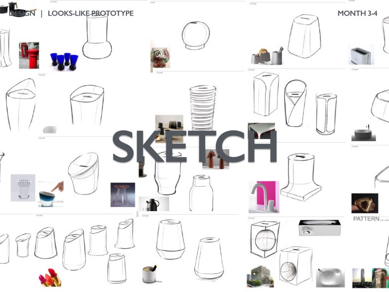
The looks-like prototype design process nearly always starts with high-level sketches of the product itself (unlike the storyboarding which is the experience of the product). Most industrial designers do prior art searches looking for relatable forms and products. DipJar’s designer looked at a huge range of other products and sampled their forms.
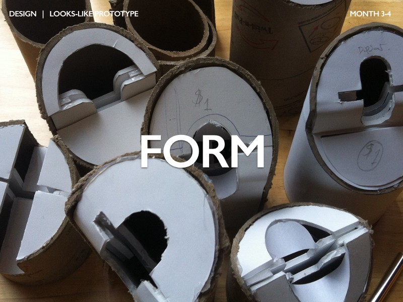
Once a few rough concepts are selected, it’s time to see how the form of the product will work in the real world. For DipJar, you can see different rough form models made from shipping tube and foam core. Each of these models takes a few minutes to make and gives a sense for how well the form will work in real-life. I’ve made form models out of everything from clay and legos to foam core and toothpicks. The only rule that applies: make them quickly and cheaply.
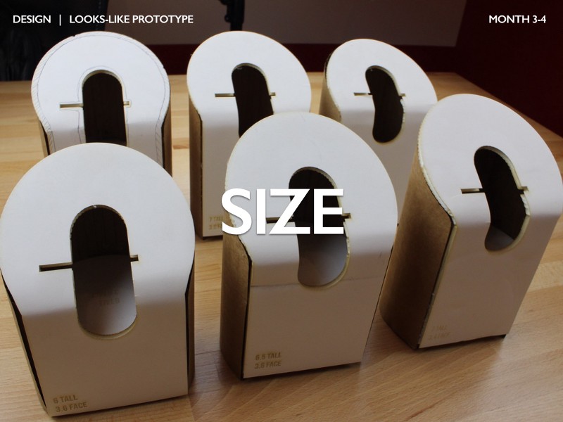
Once a general form is selected, it’s time to hone in on the details of the scale or size of the model. There are usually two or three dimensions that are critical to the product “feeling right.” In DipJar’s case, this was the height of the jar, the diameter of the face, and the geometry of the finger slot. A variety of slightly higher fidelity models are made to compare different sizes (these out of lasercut cardboard and foam core).
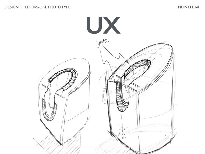
In parallel with the form models, it often becomes clear that certain details of the user experience must be highlighted. The DipJar team discovered the single biggest predictor of tipping is if the person in front of them in line tipped. We found that using sound and lights were a very effective way to signal to others in line and increasing tipping revenue. A lot of energy was invested in the placement of the lights and their design language.
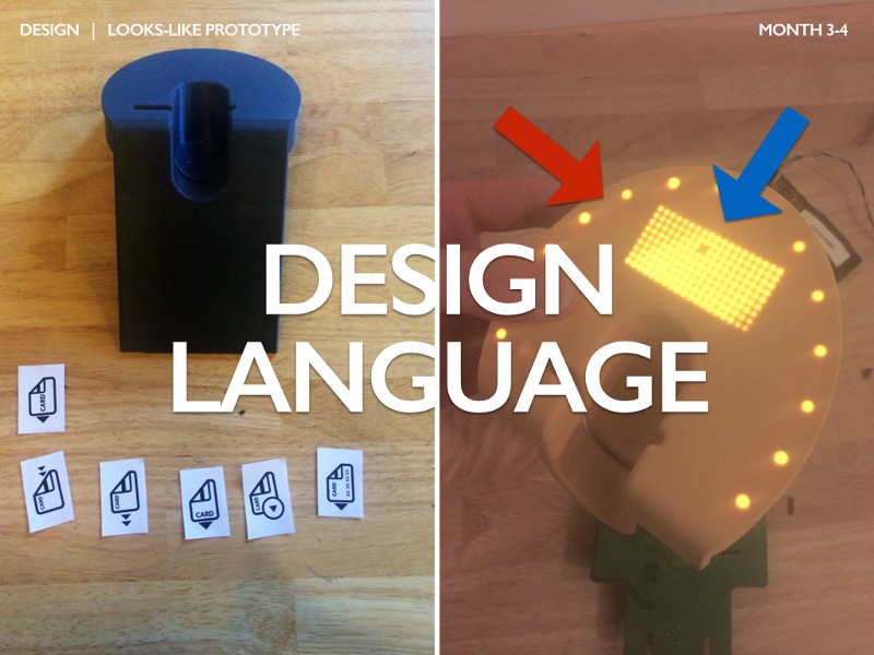
Every product has a “design language” used to communicate visually or experientially with users. For DipJar, quickly communicating the card orientation was critical. They spent a lot of time optimizing the card logo (image on the left) to ensure users could unambiguously figure out which orientation the card should be in.
The DipJar team also spent a lot of time optimizing the LED lighting patterns. The red arrow shows a ring of LEDs around the outer edge of the jar used to playfully signal a tip has been given. The blue arrow shows the outcome to a long debate the team had about store owners/charities being able to change the dollar amount of the jar. The custom-molded digital LED display allows any DipJar owner to effortlessly change the amount.
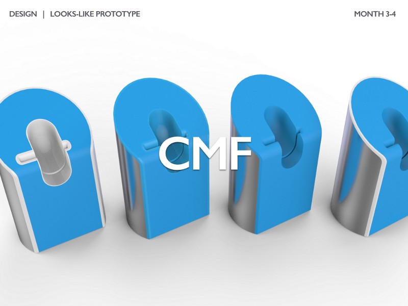
To quickly determine the final look of the product, designers study colors, materials, and finishes (commonly known as a CMF). Often this is done digitally (as shown above) but then transitions into physical samples and models. DipJar tested various styles of metal housings, polishes of plastic, colors of plastic, and radii.
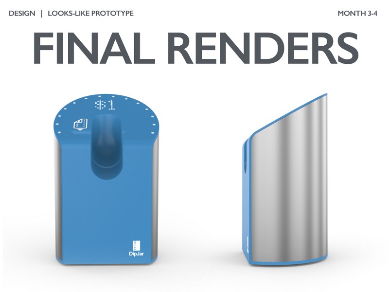
The output of the low-fidelity CMF study is a high-quality digital mockup of the product. This usually includes everything from prior steps: form, size, iconography, UX/LEDs, color, texture, and materials. These high-quality renders are also the basis for nearly all marketing material (even the marketing gods at Apple use renders for nearly everything.)
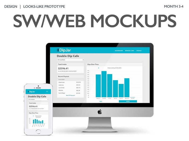
If your product has a digital interface, creating higher fidelity mockups can be extremely helpful in defining your brand’s user experience. DipJar’s primary digital assets are a web-based management dashboard for store owners and charities. There are also plans to build mobile applications for employees and tippers.
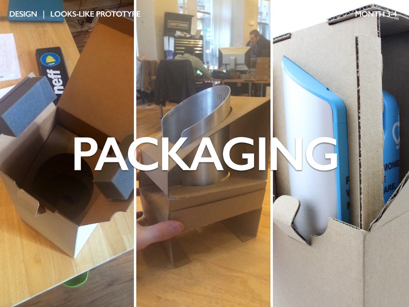
One commonly forgotten step during the design step: packaging. Even a relatively simple product like DipJar has many weeks of packaging design iteration. You can see the first generation DipJar packaging on the left and the much more efficient and elegant second generation on the right. Getting the design right is an important part of your user experience and bill of materials.
After a high-fidelity looks-like prototype is fabricated, it’s back to customers to test many of the assumptions made during the process. It’s very common to make two or three iterations to get to an excellent looks-like prototype.
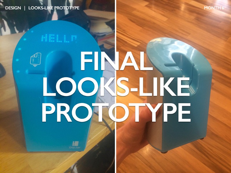
Once the design process is complete, you’re left with a beautiful model of your product that demonstrates your design intent but doesn’t function. Customers and investors should be able to quickly understand your product by interacting with this model.
In the meantime, let’s not forget about making the product function. On to Part 3: Engineering.
Ben Einstein was one of the founders of Bolt. You can find him on LinkedIn.
Bolt invests at the intersection of the digital and physical world.