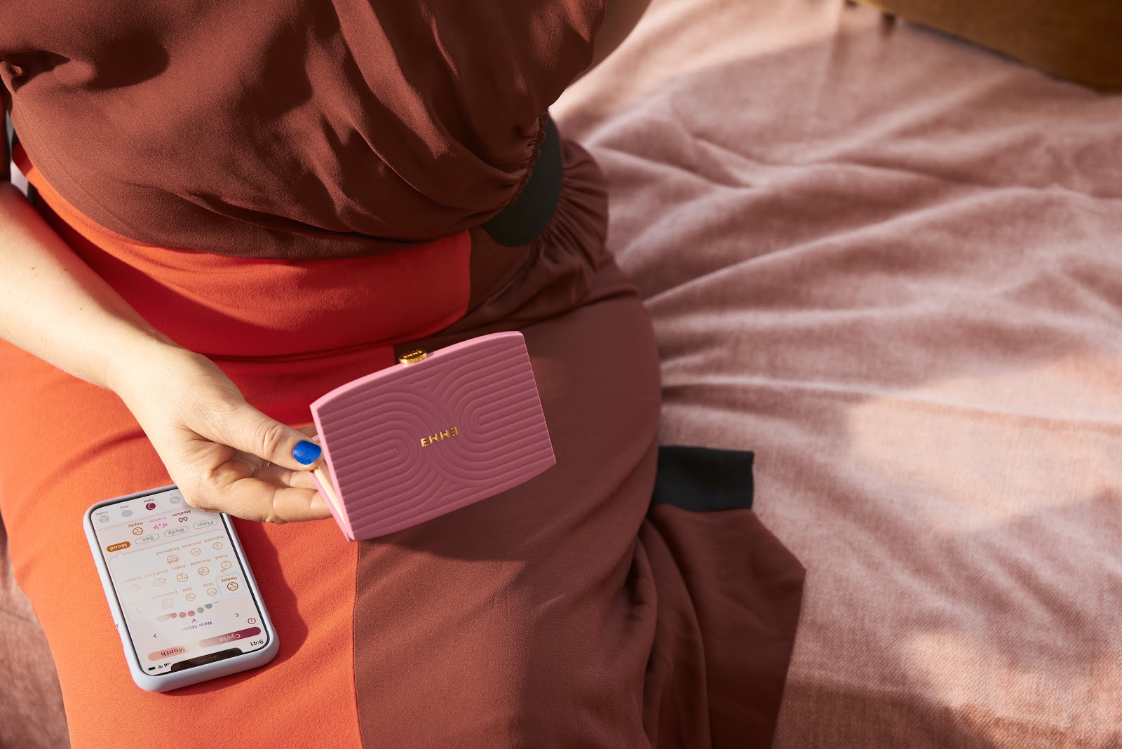
Emme is a healthcare technology company building premium healthcare tools for women. They recently launched their first product: the Emme Smart Case. It’s a lovely little portable case for birth control pills that works seamlessly with their tracking and reminder app. The Smart Case automatically logs pills, so women miss fewer and feel better. The companion app sends custom reminders—only when needed— and lets women record their cycle and mood along the way.
The Bolt team had the pleasure of collaborating with Emme on product development, and I wanted to share their design journey via a conversation I had recently with the CEO, Amanda French. Their story is a case study in opinionated interface design that’s resulted in an elegant hardware and software product coming from a place of empathy and advocacy for their customers.
Pills alone are not enough
Tyler: First off, congrats on the launch. So excited.
When I first heard about what you were working on, I was shocked to learn how ineffective taking birth control pills is. Can you walk us through some of the stats?
Amanda: Absolutely. The largest unsolved pain point in birth control management is the missed pill problem. It’s a surprisingly common issue that women identify with but was mostly overlooked until just recently by the larger healthcare community. There are ten million women in the US who are taking birth control each year, but in typical use the pill is only 91% effective. When you do the math, that means there are almost one million unplanned pregnancies in the US each year *among people on the pill*…one in 10 women. And the kicker is that this is almost all due to user error.
In perfect use, the pill is 99.9% effective, but clinical studies indicate that up to 80% of women on the pill miss at least one pill per month. This is all because there has not been a properly supportive system for tracking and sending reminders to actually help people take the pill on the schedule they want to. Depending on the requirements of your prescription, you may be trying to consistently hit a window of just a few hours…very challenging and stressful to do consistently with a busy schedule. When you’ve missed even one, the effectiveness of the pill goes down because there’s a lapse in therapy in the drug.
It’s difficult to think of another product where a 10% failure rate would be acceptable and still be so popular. Yet the pill still remains the most common form of contraception – in large part because of how relatively affordable and accessible it is compared to other options.
Missed pills obviously lead to unplanned pregnancies but they also lead to so many negative symptoms and side effects as a result of essentially going on a hormone roller coaster…heavier bleeding, acne, mood swings. These are all pain points we didn’t think people on the pill should have to deal with anymore.
There are almost one million unplanned pregnancies in the US each year *among people on the pill*…one in 10 women. And the kicker is that this is almost all due to user error.
Tyler: And it’s not just a compliance problem right? The mental and emotional burden of sticking to a routine is heavy.
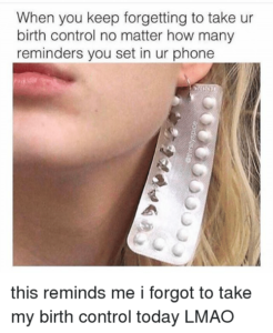
Amanda: We conducted research about women’s experience taking the pill, and the top ranking pain points were around the anxiety of remembering to take the pill and unintended side effects of occasionally missing it. It’s definitely a problem people know about it and relate too.
In our research, we learned that 42% of women on the pill take at least one pregnancy test a year, and many take more than that. Even when people are not missing many pills, they’re often spending a lot of mental energy trying to stay on schedule. One of the most common reasons people stop taking the pill is actually that it was too hard for them to remember, not that they didn’t want to be taking the medication. It’s something people really identify with.
An interface design problem
Tyler: It’s clear that the pill alone is not enough. If you zoom out and look at the whole experience, it really looks like an interface design problem more than a motivational or technological problem.
Amanda: Yes, the gap has really been in the user interface, proper tools, and support system to actually enable taking it according to instructions…completely a human interaction design gap.
And just to mention it, a common question is “Why can’t you just set an alarm on your phone?” Well, it just doesn’t work…clinical studies have shown alarms are not more effective than memory by itself, because often the alarms come at the wrong time and they don’t know if you’ve missed the pill or not. For us designing a contextual reminder system based on data was a clear choice to actually change behavior.
The gap has really been in the user interface, proper tools, and support system to actually enable taking it according to instructions…completely a human interaction design gap.
Tyler: That framing really seems to have informed the team you’ve assembled. Personally, you have deep experience in developing commercial medical devices and a user-centric design background from Stanford’s Biodesign program. You’ve brought together a complimentary mix of teammates and contributors to really come at this from a new angle.
Amanda: Yes, we went a little bit unconventional compared to what a traditional health tech company work would look like. We have people from a regulated medical device background but also the gaming industry and high volume consumer electronics. Not only diverse backgrounds but also some of the most talented people in each of those domains who’ve built Emme.
In addition to technologists and engineers, we sought out some of the best designers from the fashion, cosmetics, and beauty industry because we wanted a fresh influence in an overlooked category. Through the partnership with Deerfield, we came up with a brand experience that is really so unique compared to what you see in the health tech space.

Designed for choice
Tyler: What were your priorities for the industrial design of the Smart Case?
Amanda: We started with a very deep understanding of the unmet needs. The pill is the most common form of contraception… it’s a daily medication, but sometimes women forget the pill simply because they don’t take it with them…or other times they want to be more discrete.
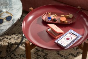
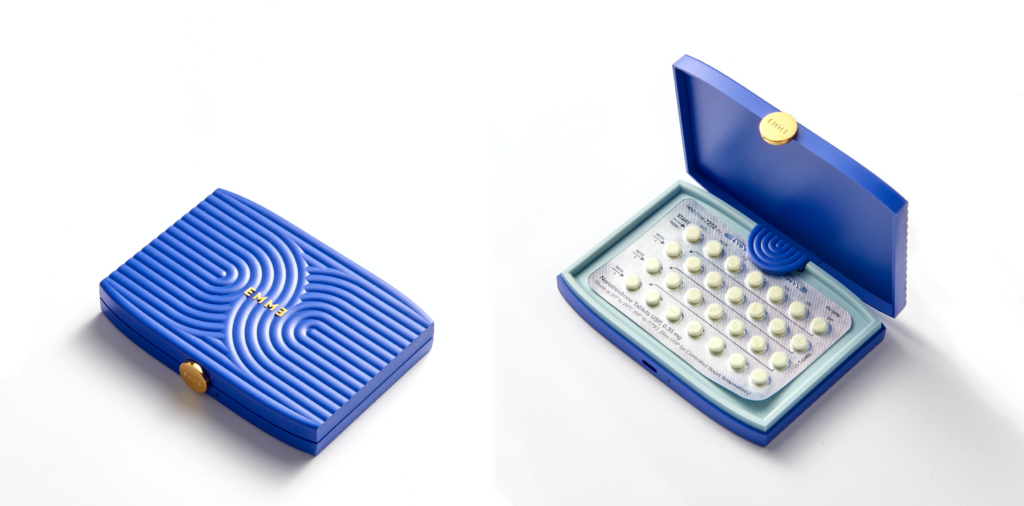
We saw an opportunity to design a lifestyle product with inspiration from beauty and fashion. If you want to show it off, you can, or if you want someone to not know what it is, and think it’s a makeup compact, it can serve that role as well. People would never know that it’s a pharmaceutical tracker…definitely not a classical medical device.
Our belief at the company is that the pill is not something people should feel ashamed about or that they need to hide. We wanted our design to be a little bit of a celebration of estrogen and the hormones that we use to manage not only contraception, but also so many other health conditions.
There’s certainly a trend of health care becoming much more consumer-oriented and not just something you think about once a year when you go to the doctor. So we wanted the product to look like something fit in with everything else in someone’s purse, backpack or on your desk. Some medical devices put less energy into the industrial design because it’ll live in a drawer or on a shelf…only used a couple times a year. Because Emme is used every day we wanted to create something that is fun to have with the rest of your accessories.
Tyler: As the design got more specific, how did you prioritize specific forms or other design choices?
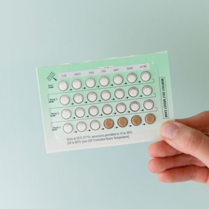
Amanda: So there are more than one hundred brands of birth control pills. For a system to really make sense, it needs to work with all of the different brands on the market. It was an extensive exercise of collecting all the brands, measuring them, determining where the pills were located that led to the rectangular form factor and helped establish constraints on the geometry.
From there, we wanted to introduce an iconic graphic element to relate to our brand. The Emme name is a palindrome, and for us it represents the partnership that we bring to women in their health journey. That’s how we landed on the design on the top of the case: swirls that are linked together to represent that bond.
Tyler: And from the original inspiration, it was clear that you were drawn to natural forms with a grounded feel. Why all the colors? I’m sure that was a challenge, but in this instance, very important.

Amanda: Haha, yes and we did read your blog post on choosing many colors before making the decision.
Through our conversations with hundreds of women, we know there are so many different personalities and styles. Some are looking for something bold (like our blue and terracotta), others want a much more subtle treatment (like our moonstone). It’s important to design for all people on the pill. We couldn’t go out on an assumption one color was going to work for everyone…that’s the assumption historically in this industry: one size fits all. We’re launching with 5 colors to stand behind our belief that women deserve choice.
Tyler: And to deliver on that challenge, you had to get deep in your supply chain. You can’t just design something in CAD and expect it to come out as intended. Talk about your strategy there.
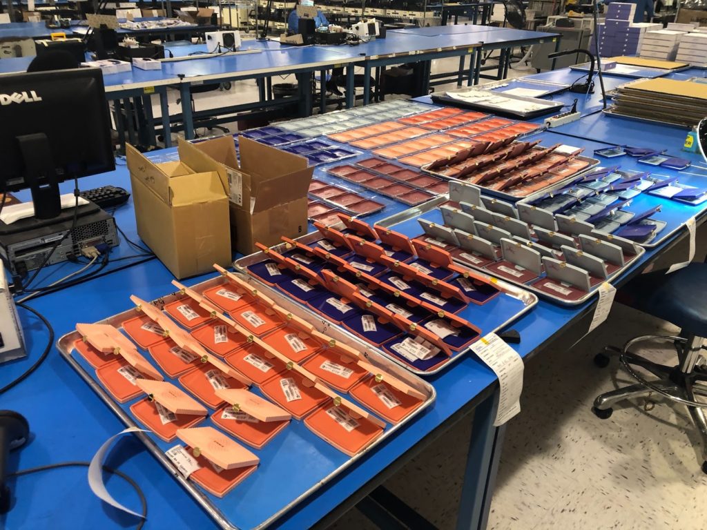
Amanda: We went another layer deeper than just our contract manufacturer and directly partnered with tooling and enclosure part vendors that work with much larger clients and who could deliver on quality but were also willing to work with select startups. It was helpful to leverage our collective relationships that not all startups have access to. We work with a top-tier enclosure vendor who does premium consumer electronics and a jewelry manufacturer for the logo badge on top and the clasp.
Minimally interactive tech
Tyler: Tell us more about the functionality of the case and how it interacts with the tracking app.
Amanda: We learned from women that there are so many different types of pill routines and reminder profiles needed: some people miss pills because they were traveling and are in different time zones, others are in different locations different times of the week or have a different work schedule on some days. It was important to have a product that worked not only for different pill brands but also different lifestyles.
We designed the product to require as little intervention or maintenance as possible. The case itself has multiple sensors which detect when you open the case each day and when you take the blister pack out. It tracks not only that the pill was taken, but what time the pill was taken. As soon as someone takes the pill each day, that data syncs with the app and it knows to stop reminding you. If there’s not data from the case, the app will continue to send reminders to take the pill.
In the app, you can schedule up to three reminders at custom times each day, if you’ve taken the pill you wont get any extra reminders but if you are at risk of missing your pill, that’s when the app starts to communicate more. The sensors enable a custom reminder profile and app experience that makes your pill routine much more personalized that it is today.
Tyler: When your main value proposition is confidence and easing a persistent mental burden, you have to execute the interface very minimally to not introduce yet another device to manage.
Amanda: Exactly, for instance, we specifically chose a sensor system and overall electrical system design that allowed for low power operation to last for up to 6 months. If people are relying on our product to take the pill we didn’t want them to have to worry about charging it all the time.
Another common complaint is when you’re traveling and trying to make sure you’re taking the pill at the appropriate time, if you only have an alarm on your phone, it has no idea that it should be adjusting what time it goes off. In our app we have an automatic time zone change detector that detects when you’ve traveled, and it updates the reminders automatically.
Tyler: An important part of any interface design is considering the edge cases. What were those for you?
Amanda: At those times where taking the pill still isn’t practical, we learned that people don’t always know whether or not they need to use backup contraception or how to handle missed pills. A unique feature of our app is that we can use the data tracked from our system to determine what information to show. If someone has missed two pills in a row, we show the guidelines from the CDC so they have that information right at their fingertips without having to call a doctor in order to understand what to do next.
Qualitative metrics and quantitative proof points
Tyler: How did you approach user testing?
Amanda: It was very important to us as a healthcare company to validate that our product was effective before scaling it and make sure we understood any inputs that would lead us to adjust the design.
We (relatively) quietly put up a beta waitlist signup online and within a couple weeks had a thousand women sign up! A very early indication of how much interest there was for the product. We chose seventy participants who were representative of national demographics of people on the pill and did an intake survey to understand their current pain points, current adherence, and tracked their experience over six months both through both the automatic data collection from the product as well as weekly surveys to capture qualitative feedback.
At the end of that period, we saw a *dramatic* reduction in missed pills for women using the product. The data showed the Emme system leads to a 80% reduction in missed pills. To see such a difference is quite meaningful.
There are also a number of secondary benefits relating to confidence and peace of mind that our users tell us about. Because they’re missing fewer pills, they’re spending less time thinking about avoiding missed pills. They feel more confident in their pill routine and feel more empowered to focus on all of the other incredible things they’re doing the rest of the day. It’s one less thing to worry about.

Tyler: Did the feedback from beta users lead you to make any product changes?
Amanda: The beta version of the product did not have a rechargeable battery and that was something highly requested from consumers so we added a rechargeable battery and a charging cable in the package. We also had a lot of interest in symptom and experience tracking which was not in the first version of our app. We learned that people really wanted to connect the dots between their pill experience and their habits so we prioritized that functionality after the beta and it’s been one of our most popular features.
More to come…
Tyler: Amanda, thanks again for sharing the design journey. At Bolt, we’re obviously super proud to be your pre-seed lead investor and count it as a privilege to work alongside such talented, mission-driven folks. Can’t wait to see what’s next.
Amanda: Overall this design process was so important for us: every step of the way, we want to make sure we’re designing this product with the actual people in mind who are on the pill.
The pill forever changed women’s health in 1960, Emme is making it compatible with the 21st century. This is what it looks like to bring modern technology into that experience.
Bolt invests at the intersection of the digital and physical world.
